


ArtFonts: Stylish Text
4.7930.00 Reviews
App Specs
- Version
- 2.1.0
- Updated On
- License
- Free
- Downloads
- 10,000,000+
- Developer
- Galaxy studio apps
- Categories
- Personalization
- Platform
- Android
Screenshots
 Analysis by AppCompare
I treat a text-styling app a little differently from a game or a photo editor: it can sit close to everyday conversations, so its usefulness depends not only on how decorative the results look, but also on whether I can choose when and where to use them. ArtFonts: Stylish Text is a free personalization app from Galaxy studio apps, currently at version 2.1.0. Its 4.7 average from around 78,000 ratings and more than 5 million installs suggest that plenty of people enjoy this kind of quick visual tweak, though popularity alone is not a reason to hand over more access than a feature needs.
What I would check before making it part of my routine
My first step with any app that helps compose messages is to pay attention to the choices it presents during setup and when I use a feature. I don’t assume that a keyboard, text tool, or personalization app has a particular privacy practice just because it looks simple. I look at the permission prompts themselves, read what each one is asking for, and consider whether the requested access makes sense for the action I want to take.
That distinction matters here because decorative text can be prepared in more than one way. I can use a styling app as an occasional place to shape a caption, or I can choose to make text entry part of a more regular workflow. Those choices may involve different levels of convenience and access. I’d make them deliberately rather than enabling every option automatically, especially if I’m composing personal messages or account details.
Keep sensitive writing separate from playful styling
A practical boundary I use is to reserve stylized lettering for public-facing or low-stakes text: a social caption, a short greeting, a profile line, or a playful message to someone I know. For passwords, payment details, private work notes, or anything that needs to remain easy to read and copy accurately, I stick with ordinary text. That is useful advice for any decorative text workflow, not a claim about what this app collects or stores.
I also think about the destination before I send anything. A font-like effect may be represented by special characters rather than by a visual font file, so the appearance can depend on how another app or device handles those characters. If a message matters, I’d preview it in the actual conversation or post composer and check that it remains legible. A decorative style that looks charming in a sample can become awkward in a long paragraph or on a screen with different text rendering.
Small habits that make the app easier to use thoughtfully
I’d begin with one short phrase instead of transforming a whole message. That gives me a quick way to judge readability and confirm that the target app displays the result as intended. I’d also keep an unstyled copy of anything important before replacing it with decorative characters; that makes editing and reuse easier if a platform changes the appearance or the recipient sees a different rendering.
Saved styles, where available in the experience, are most useful when treated as a small personal toolkit rather than a collection of effects to apply everywhere. I’d keep a dependable, readable option for everyday captions and reserve more elaborate looks for a title or a few emphasized words. This avoids the common trap of making a message visually busy and gives the decoration a clearer purpose.
Worth Reading Before You Choose

EA SPORTS FC Mobile 26 Is a Bigger Football Game, but It Takes Time

Flipboard Shows What News Apps Must Do Beyond the Feed

Switching to Android Auto Means Rethinking Your Driving Routine

Google Calendar Makes a Crowded Week Easier to Manage

Ludo King Makes the Most of the Minutes Between Plans

Baby Panda World Brings Quick Play to Modern Phones, but Its Game Library Feels Busy
The age rating is Everyone, and the app is free to install, with optional in-app purchases ranging from $0.99 to $99.99 per item. I’d explore the free experience first and pay attention to any purchase prompt so I know what I’m choosing. That price range is broad enough that I would check the exact item and terms shown in the app before confirming a transaction, rather than assuming every style or tool is included at no cost.
For a person deciding whether it belongs on their phone, I’d frame the choice simply: it is aimed at people who enjoy adding visual character to short text, not people who need a full typography studio or a guaranteed uniform look across every platform. If I wanted precise control over a designed graphic, I’d make the text in a layout or image-editing tool instead. If I only wanted a clean, consistent typeface inside one social app, its built-in formatting options would probably be less fiddly.
What makes a text-styling app worth keeping is not the number of effects it can show, but whether I can find one or two that suit my actual habits. I’d try it with a profile line, a brief announcement, and a casual message, then decide whether the results are readable enough to reuse. That small test tells me more than applying an elaborate style to a long message right away.
Ever stumbled upon an app that instantly jazzes up your daily texting game? Well, let me introduce you to ArtFonts: Stylish Text. It's like having a turbocharged keyboard that turns your plain text into something way more exciting. So, I decided to give it a whirl, and here’s what I found.
Getting Started: First Impressions
First things first, downloading and setting up ArtFonts: Stylish Text was a breeze. It’s available on both Android and iOS, so no one's left out. Once installed, it welcomes you with a clean and intuitive interface. No overwhelming menus or confusing setups here. Just a quick tutorial, and you're all set to start transforming your text.
Features Galore
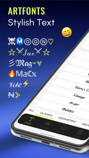
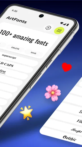
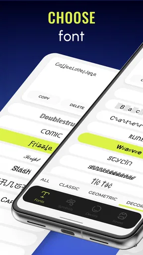
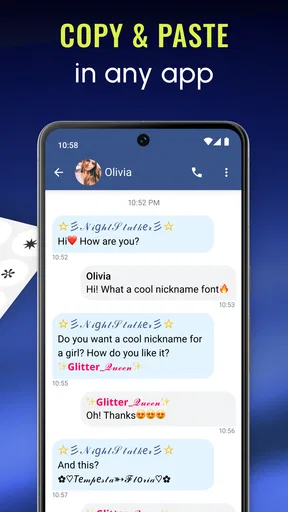
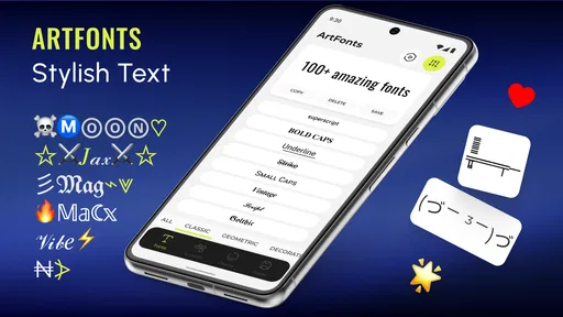
Now, let's dive into what this app offers. The primary feature is, of course, the variety of stylish fonts. We're talking about a plethora of styles—from elegant cursive to edgy block letters. With just a few taps, you can switch up your text style in any app, be it social media, messaging, or even notes.
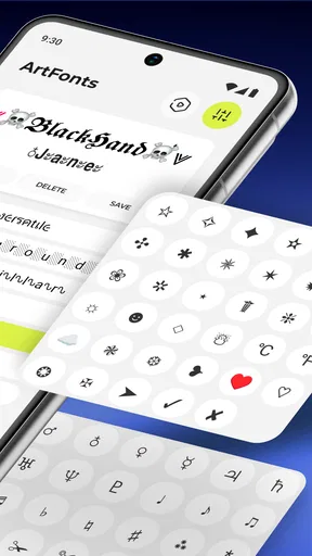
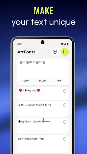
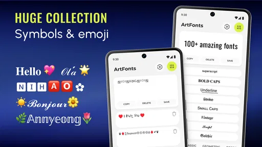
But wait, there’s more! The app isn’t just about fonts. You’ve got emoticons, symbols, and even the ability to create your own custom styles. My personal favorite is the option to save frequently used styles. It’s like having your own personalized font library at your fingertips.
Customization and Usability
One of the standout features for me was the degree of customization. Unlike some apps that restrict you to predefined styles, ArtFonts allows you to tweak and create. You can adjust the size, color, and even combine different styles to suit your mood or the tone of your message.
Usability-wise, it integrates seamlessly with other apps. Whether you're on WhatsApp, Instagram, or Facebook, switching styles is smooth and quick. The app doesn’t lag or crash, which is a huge plus in my book. It’s perfect for those who love to add a personal touch to their messages without the hassle.
Why You'll Love It
If you’re someone who loves to stand out in a conversation, this app is for you. The sheer variety of fonts and symbols can make your messages pop. Plus, it’s incredibly fun! I found myself experimenting with different combos just because it’s so easy to do.
Another thing I noticed is how it sparks creativity. With so many options, you can get really creative with how you express yourself. It’s not just about aesthetics; it’s a tool for self-expression. Whether you’re crafting a perfect Instagram caption or just spicing up a text to a friend, the possibilities are endless.
Where it fits in an everyday routine
The strongest use case, in my view, is short text that benefits from a little emphasis without needing a separate graphic. Imagine writing a birthday message while waiting for coffee: I might test a decorative greeting, copy the version I like, and send it through my usual messaging app. For a social post, I could style just the opening words, leaving the rest plain so the caption remains comfortable to read on a phone.
That selective approach is more effective than changing every line. A distinctive opening can help a caption feel personal, while a whole block of ornate characters can slow down anyone trying to scan it. I’d also avoid using special lettering for directions, contact details, or text people may need to copy precisely. The more practical the message, the more valuable ordinary characters become.
For someone who posts often, saved styles can reduce the small chore of choosing from scratch each time. I’d make a few options that serve different purposes—one restrained treatment for a profile or heading, another more playful one for a greeting—and then use them consistently. If I keep changing styles without a reason, the extra choices become friction rather than a creative benefit.
What to expect across apps and devices
There is an important difference between changing a font inside a designed image and using stylized characters in a message. In the latter case, the recipient’s device and the destination app influence how those characters appear. I would not count on every effect looking identical everywhere. A style that survives in a short social caption may not be the best choice for a note that will be edited, searched, or copied later.
That is why I’d use a quick preview as part of the workflow. After inserting a sample into the destination app, I’d check the spacing, punctuation, and any symbols before publishing or sending. If a letter becomes hard to distinguish, I’d switch to a simpler style rather than assuming the recipient will see the same version I do. This is a small check, but it prevents decoration from getting in the way of the message.
Compared with a conventional keyboard, a dedicated styling app offers a more focused set of decorative choices and the fun of experimenting with combinations. A standard keyboard is still faster for ordinary writing, and a graphic design app gives finer control when the final result needs to be an image with exact placement and visual hierarchy. I see this app between those two options: useful for expressive snippets, less suited to polished posters or long-form text.
Who I’d recommend it to—and who may prefer something else
I’d recommend trying it if you regularly personalize social statuses, short bios, or casual messages and enjoy choosing how your words look. It is also a reasonable fit for someone who wants a quick creative detour without building a complete graphic. The app’s personalization focus is clear, and the free starting point makes it easy to see whether this kind of decoration matches your routine before considering optional purchases.
I’d skip it if your priority is plain, universally readable text, if you rarely customize messages, or if you need professional-level control over typography and layout. It may also feel like an unnecessary extra step if the built-in tools in your preferred social app already do what you want. For accessibility-conscious writing, or any message where clarity is more important than style, I’d choose ordinary text and keep the visual flourish out of the way.
My cautious verdict is that this is best treated as a creative utility, not as a replacement for a normal keyboard or a design editor. I’d explore the styles with harmless sample text, make deliberate choices about any access prompts, and keep sensitive writing in the ordinary tools I already trust. Galaxy studio apps has positioned it for everyday personalization, and its Everyone rating makes the intended audience broad; the useful question is simply whether decorated text adds enough enjoyment to justify another step in how you write.
Final Thoughts
In a world where digital communication is key, ArtFonts: Stylish Text adds a much-needed dose of personality. It’s user-friendly, packed with features, and just plain fun to use. Whether you’re a font fanatic or just someone looking to add a bit of flair to your text, this app is worth checking out.
So, why not give it a shot? Download it, play around with the styles, and let your texts do the talking. Who knew fonts could be this fun?
Pros
- Wide range of font styles available.
- Easy to integrate with social media apps.
- User-friendly interface for quick access.
- Regular updates with new font options.
- Lightweight app with minimal storage use.
Cons
- Limited free fonts; many require purchase.
- Occasional ads can disrupt the experience.
- Some fonts may not support all languages.
- In-app purchases may become costly.
- No offline mode available for use.
FAQs for ArtFonts: Stylish Text
What features does ArtFonts: Stylish Text offer to enhance my text styling experience?
ArtFonts: Stylish Text provides a wide range of features, including a vast library of unique fonts, text decorations, and symbols. Users can easily customize their messages with stylish text effects, making their social media posts, messages, and documents stand out. The app also supports multiple languages, ensuring versatility in its use.
Is ArtFonts: Stylish Text compatible with all social media platforms?
Yes, ArtFonts: Stylish Text is designed to be compatible with most major social media platforms, such as Instagram, Facebook, Twitter, and WhatsApp. Users can seamlessly copy and paste their styled text into these apps, ensuring their posts and messages maintain the desired aesthetic across different platforms.
Does the app require an internet connection to function properly?
ArtFonts: Stylish Text does not require a constant internet connection for basic functionalities such as applying fonts and styles. However, an internet connection may be necessary for accessing certain online features or for downloading additional content updates and fonts.
Are there any in-app purchases or subscription fees associated with ArtFonts: Stylish Text?
While the app offers a variety of free fonts and styles, there are premium features and exclusive content available through in-app purchases or a subscription model. These purchases allow access to additional fonts, styles, and regular updates, enhancing the overall user experience.
How user-friendly is ArtFonts: Stylish Text for beginners?
ArtFonts: Stylish Text is designed with user-friendliness in mind, offering an intuitive interface that makes it easy for beginners to navigate. The app provides tutorials and tooltips to guide users through its features, ensuring that even those new to text styling can use the app effectively without any hassle.


